 By Staff
January 15th, 2021
BURLINGTON, ON
Understanding what is going on around us sometimes means looking at the data that has been collected.
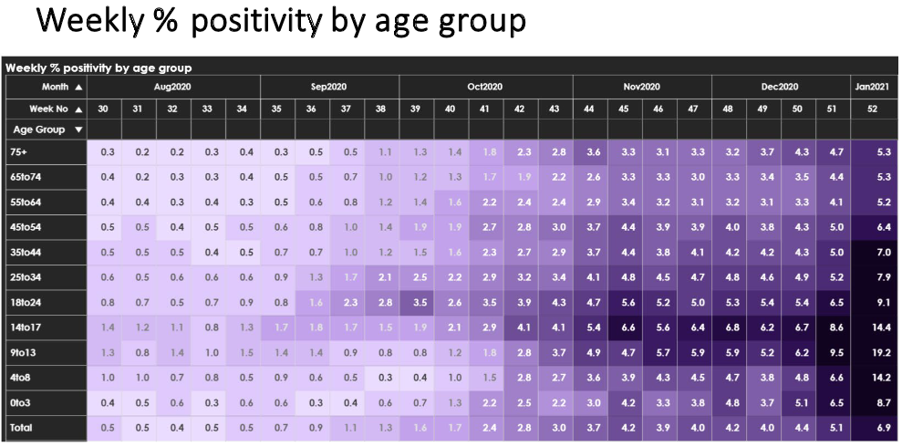
 Set out is a chart that shows the positivity rate of the testing that was done. Shown as a percentage of the tests done and broken out by week and then by age group we can see which age groups had the highest positivity.
The data was released by the Science Table, one of the Covid Advisory groups set up by the provincial government to provide data on which decisions could be made.
There are some surprises in the data.
Younger people are testing positive but not getting all that sick whereas older people have lower positivity rates but they are dying.


Worrisome is right.